SIGIL
A 0→1 hardware crypto wallet — physical product, interaction design, and brand identity. Sole designer, 3 weeks.
A 0→1 hardware crypto wallet — physical product, interaction design, and brand identity. Sole designer, 3 weeks.

2024
VENTURE DESIGN & BRAND CONSULTANT
HARDWARE DESIGN
INTERACTION DESIGN
BRAND IDENTITY
Traditional hardware wallets force you to confirm every transaction manually, deliberate friction that protects long-term holders but becomes a liability when you're trading at pace. The design challenge was genuinely rare: a product that had to work across physical design, interaction design, and brand identity simultaneously, and do all three without compromise.
To design a device that active traders would actually use daily; fast enough to keep up, discreet enough not to attract attention, and considered enough that someone with taste would want to own it.


Five methods. Eleven trader interviews. Four two-hour workshops where pro traders co-designed the strategy alongside us, not as feedback givers, as partners.
Existing hardware wallets look cool and interesting. Users told us they find that to be a problem. Its so obvious that its a hardware wallet and it makes them feel nervous to take it anywhere.
And the app UX? Often more complicated that it needs to be, a 52% of the high volume traders we spoke to indicated they don't bother with hardware wallets at all because they cant be bothered to figure out the setup - they leave their funds in custodial wallets provided by exchanges that are unlikely to go bust.
A discrete device that resembles a well designed external drive. We knew we would need to iterate to get it right so affordability on production would need to be a guiding constraint. The app itself would focus on requiring the fewest steps necessary and an experience that replicates the ease of a custodial wallet sign up.

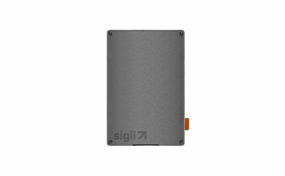

The form factor is deliberately anonymous, nothing that reads as expensive crypto hardware to a casual observer. Security through obscurity, designed in from the start.
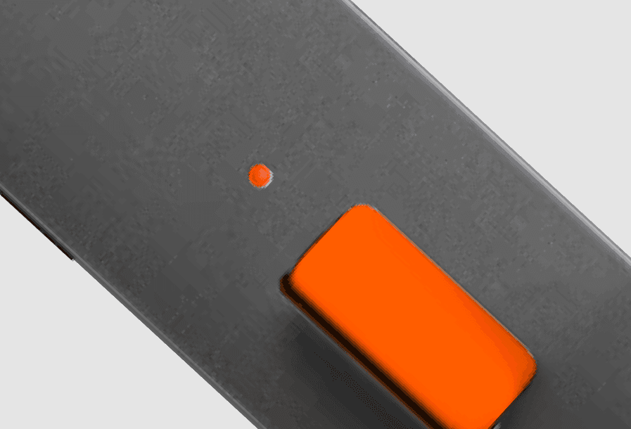
Someone should be able to look at Sigil and know instantly it's Sigil without a logo front and centre. The orange accent does that work across hardware, UI, and identity simultaneously.
By changing the accent colour and engraving, Sigil produces community-branded versions for crypto projects to distribute to members. The product is the distribution mechanic; designed in from day one.

On a desk, through airport security, in a meeting; a device that screams crypto is a liability. Sigil was designed to look like an external hard drive. Unremarkable by design. No one would question why you have it on you and its big enough to accommodate the circuit boards required for the extra features we were baking in.
The only colour on the device. It appears on the physical hardware, in the UI, and across the identity; immediate recognition at every touchpoint without a logo in sight.
The app experience is simple, intuitive and informative. Friendly 3 step set up process with plenty of animated user feedback along the way. The experience replicates web2 experiences without compromising on safety. Rather than allowing complex technical configuration of the rules, we created a list of the rule types available to remove any guesswork for less technical users.
Instead of committing to large manufacturer minimums, leaned into high quality 3d printed materials with bespoke finishes using a third party printing studio and raspberry pi's. Used this as a design constraint resulting in the ability to rapidly iterate on form without increasing overhead and ability to order stock as required while we prove PMF.
In future I would research hardware and software requirements in tandem rather than phasing them. To begin with our research revolved around the value prop of a "warm wallet" (as supposed to hot or cold storage) and our line of questioning revolved around the software and app UX and capabilties required. The most meaningful insights on consumer behaviour however came when we researched preferences to do with the form factor. By then we had already built the app interface and ended up having to reskin it to match the brand/tone of the physical hardware.
A 0→1 hardware crypto wallet — physical product, interaction design, and brand identity. Sole designer, 3 weeks.
2024
VENTURE DESIGN & BRAND CONSULTANT
HARDWARE DESIGN
INTERACTION DESIGN
BRAND IDENTITY
Traditional hardware wallets force you to confirm every transaction manually, deliberate friction that protects long-term holders but becomes a liability when you're trading at pace. The design challenge was genuinely rare: a product that had to work across physical design, interaction design, and brand identity simultaneously, and do all three without compromise.
To design a device that active traders would actually use daily; fast enough to keep up, discreet enough not to attract attention, and considered enough that someone with taste would want to own it.
Five methods. Eleven trader interviews. Four two-hour workshops where pro traders co-designed the strategy alongside us, not as feedback givers, as partners.
Existing hardware wallets look cool and interesting. Users told us they find that to be a problem. Its so obvious that its a hardware wallet and it makes them feel nervous to take it anywhere.
And the app UX? Often more complicated that it needs to be, a 52% of the high volume traders we spoke to indicated they don't bother with hardware wallets at all because they cant be bothered to figure out the setup - they leave their funds in custodial wallets provided by exchanges that are unlikely to go bust.
A discrete device that resembles a well designed external drive. We knew we would need to iterate to get it right so affordability on production would need to be a guiding constraint. The app itself would focus on requiring the fewest steps necessary and an experience that replicates the ease of a custodial wallet sign up.
The form factor is deliberately anonymous, nothing that reads as expensive crypto hardware to a casual observer. Security through obscurity, designed in from the start.
Someone should be able to look at Sigil and know instantly it's Sigil without a logo front and centre. The orange accent does that work across hardware, UI, and identity simultaneously.
By changing the accent colour and engraving, Sigil produces community-branded versions for crypto projects to distribute to members. The product is the distribution mechanic; designed in from day one.
On a desk, through airport security, in a meeting; a device that screams crypto is a liability. Sigil was designed to look like an external hard drive. Unremarkable by design. No one would question why you have it on you and its big enough to accommodate the circuit boards required for the extra features we were baking in.
The only colour on the device. It appears on the physical hardware, in the UI, and across the identity; immediate recognition at every touchpoint without a logo in sight.
The app experience is simple, intuitive and informative. Friendly 3 step set up process with plenty of animated user feedback along the way. The experience replicates web2 experiences without compromising on safety. Rather than allowing complex technical configuration of the rules, we created a list of the rule types available to remove any guesswork for less technical users.
Instead of committing to large manufacturer minimums, leaned into high quality 3d printed materials with bespoke finishes using a third party printing studio and raspberry pi's. Used this as a design constraint resulting in the ability to rapidly iterate on form without increasing overhead and ability to order stock as required while we prove PMF.
In future I would research hardware and software requirements in tandem rather than phasing them. To begin with our research revolved around the value prop of a "warm wallet" (as supposed to hot or cold storage) and our line of questioning revolved around the software and app UX and capabilties required. The most meaningful insights on consumer behaviour however came when we researched preferences to do with the form factor. By then we had already built the app interface and ended up having to reskin it to match the brand/tone of the physical hardware.